
What defines comic art styles across different eras?
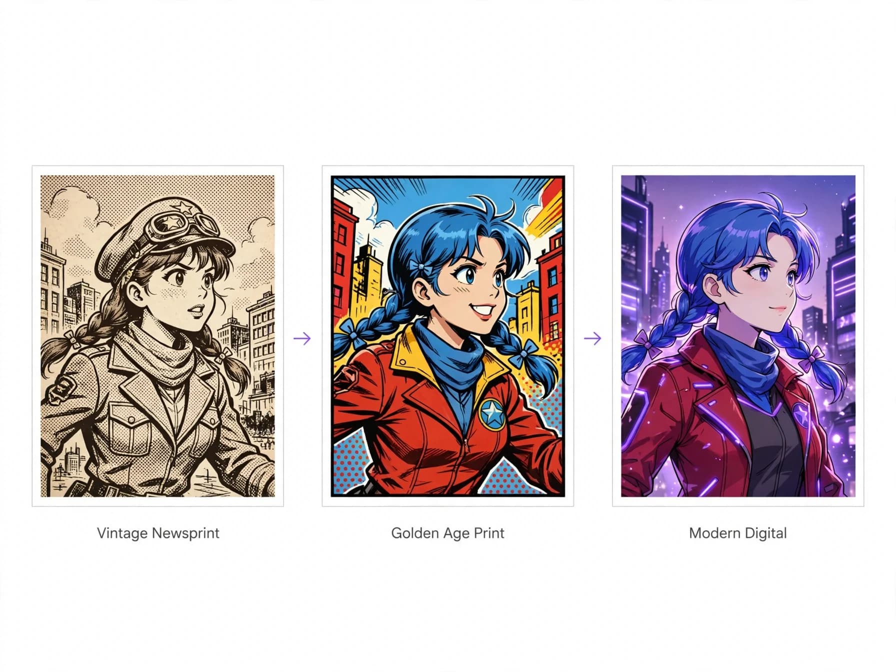
These styles reflect the printing constraints, cultural movements, and storytelling priorities of their respective periods. From hand-carved plates to newsprint presses, the technical boundaries of each decade dictated how illustrators rendered lines and shadows. Early newspaper strips relied on sparse line work so ink would not bleed across porous paper.
The Golden Age introduced bold hero silhouettes and saturated primary colors built from coarse four-color process screens. As reproduction quality improved in the Silver and Bronze Ages, cross-hatching and expressive anatomy pushed panel art toward cinematic drama. Modern digital production eventually removed mechanical ink limits, allowing painters and pencilers to merge photorealistic textures with graphic linework.
Understanding these historic shifts helps creators pinpoint why certain aesthetics evoke specific emotional reactions. A vintage newsprint aesthetic immediately suggests nostalgic grit, while sharp vector lines feel immediate and contemporary. Choosing a visual language begins with recognizing how history shaped each visual convention.
Regional traditions from East to West
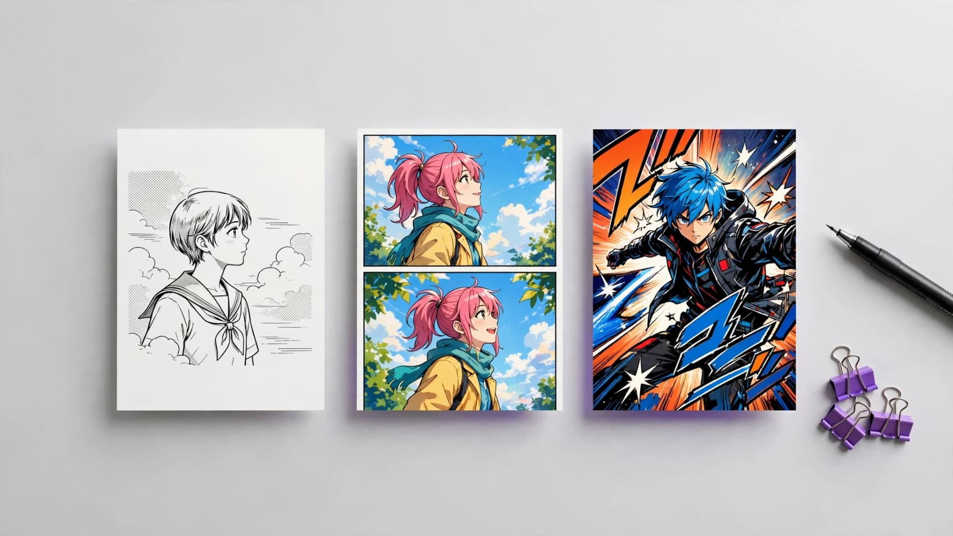
Western dynamic realism. Exploring the major types of comic art styles reveals how geographic hubs created distinct visual languages for serialized storytelling. Western mainstream traditions emphasize muscular anatomy, dynamic perspective grids, and layered chiaroscuro inking. These pages favor cinematic action shots with heavy blacks that ground heroic figures in physical space. Japanese manga traditions. Japanese manga art styles prioritize character emotional expression, varied screen tones, and fluid speed lines over anatomical hyper-realism. Published predominantly in black and white, traditional manga relies on stylized eyes, selective framing, and expressive character silhouettes to carry narrative momentum. Readers follow varied panel shapes that mirror emotional pacing. Korean vertical webtoons. Digital manhwa and webtoons reimagined serialization for mobile screens through long vertical scrolling layouts. Vibrant full-color digital painting, luminous rim lighting, and clean line art dominate this format. Generous vertical spacing between panels creates dramatic pauses tailored specifically for smartphone readers.
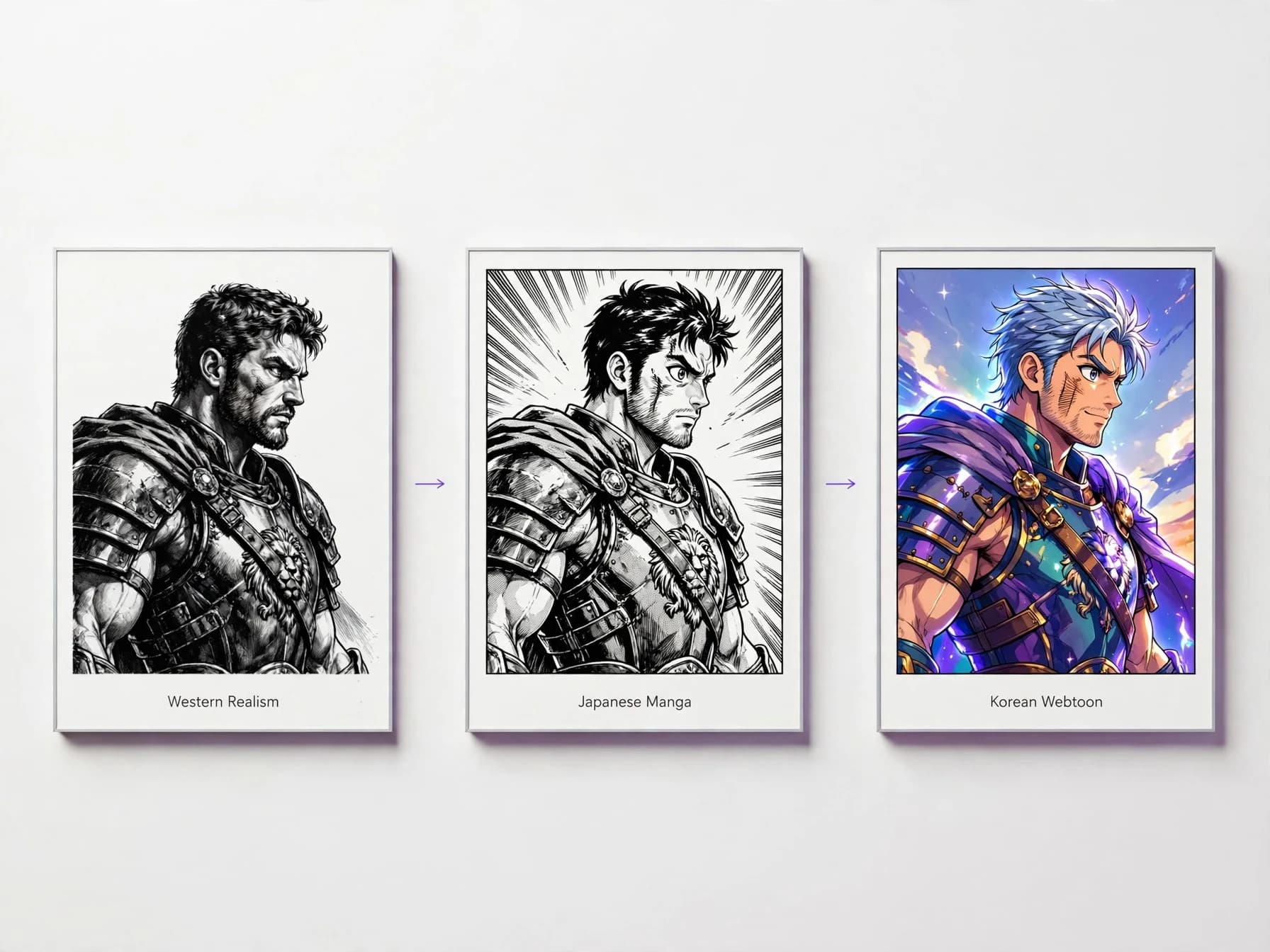
Visual anatomy of signature illustration methods
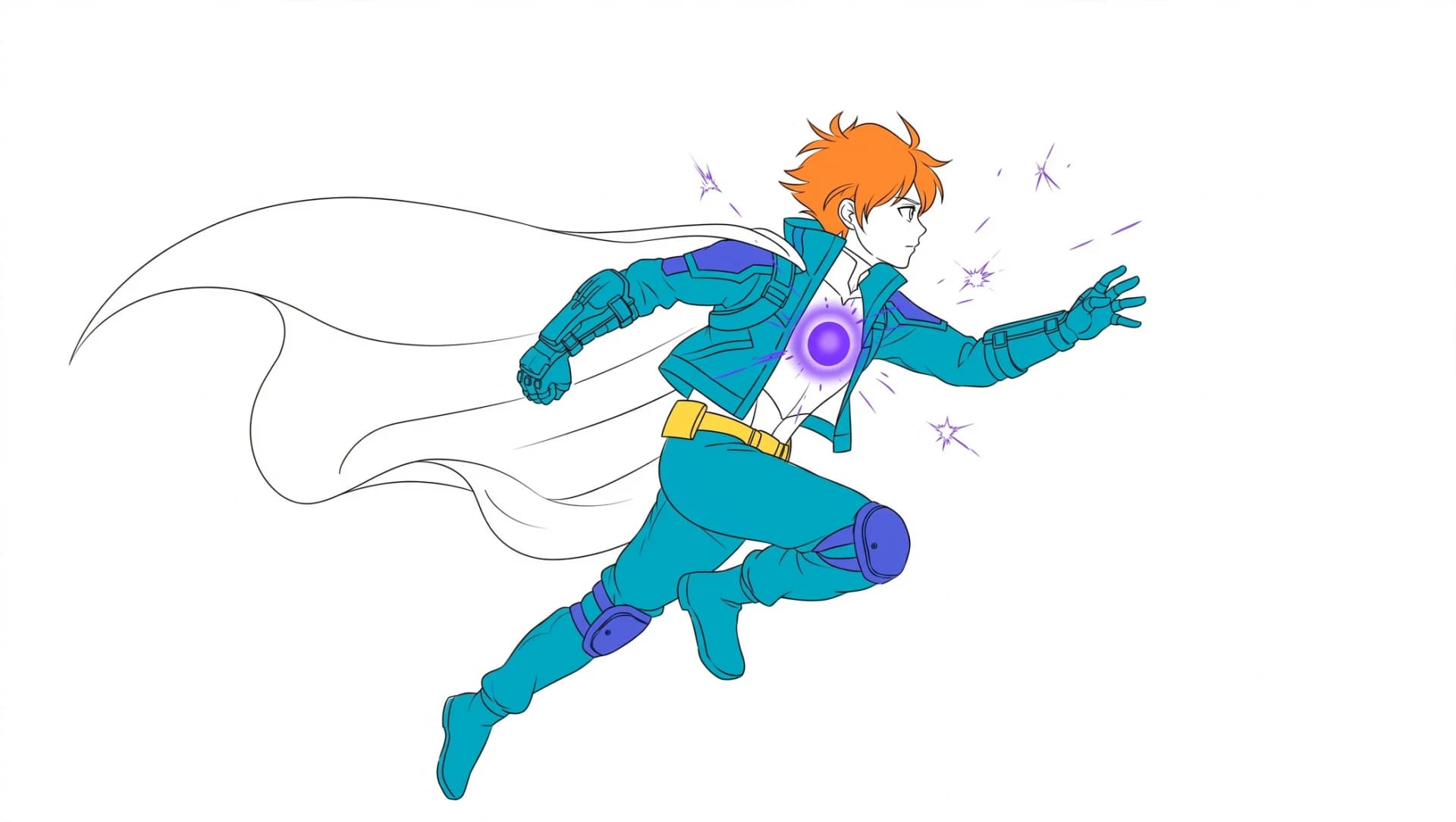
Ligne claire clarity. Developing a unique style often comes down to manipulating line weight, negative space, and tonal balance across every panel. The European ligne claire tradition, made famous by Franco-Belgian albums, uses monoline ink strokes where every contour shares an equal thickness. Background architecture receives the same crisp clarity as the characters, producing an immersive graphic world. High-contrast noir chiaroscuro. In contrast, noir comic drawing styles discard midtones in favor of stark black-and-white silhouettes and sharp cast shadows. Heavy ink brushwork hides facial features and environment details, forcing the reader to interpret mystery and tension from negative space. This approach turns shadows into active storytelling elements rather than mere background shading. Stylized graphic abstraction. Alternative and indie publications frequently rely on simplified or exaggerated shapes that amplify thematic resonance. Caricatured figures with expressive contours communicate vulnerability, humor, or dread far faster than literal realism. Stripping away unnecessary detail lets core character emotions resonate immediately.
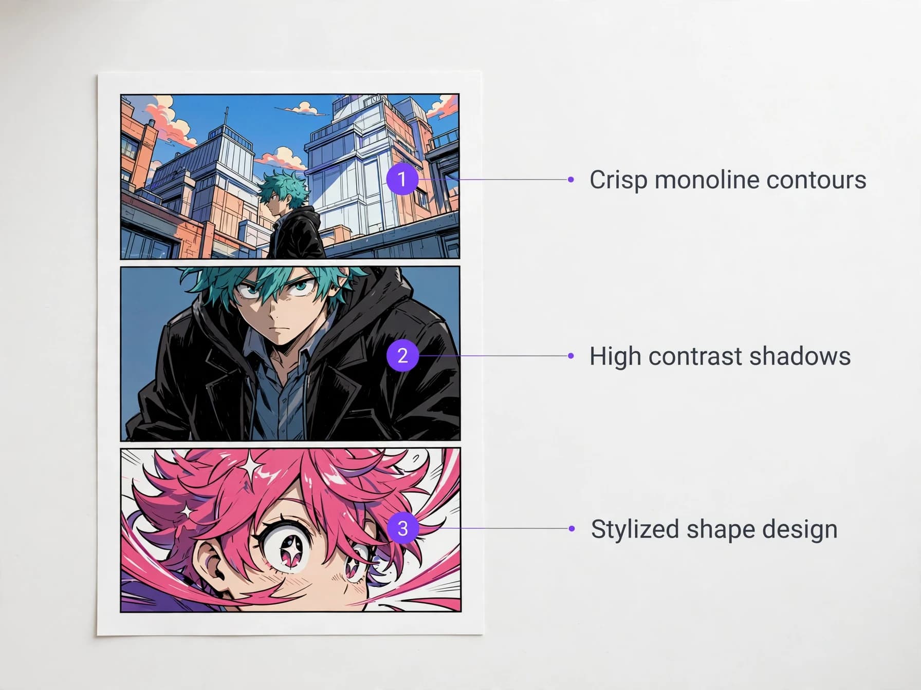
How line weight and color palettes shape narrative mood
Historical comic book art styles evolved alongside changes in commercial printing, paper stock, and coloring technology. Variable brush lines communicate weight, physical tension, and organic movement, whereas uniform technical pens suggest clinical precision or mechanical rigidity. The thickness of an exterior contour determines how sharply a subject detaches from background scenery.
Color theory plays an equally decisive role in establishing atmospheric tone and psychological subtext. Desaturated earthy palettes with muted olive and ochre tones evoke post-apocalyptic survival or grounded historical fiction. In contrast, high-saturation pastels and luminous neon gradients immediately signal romantic comedy, slice-of-life charm, or futuristic cyberpunk settings.
Balancing inking density against color values ensures panels remain legible even during chaotic action sequences. When heavy ink lines compete with dark background washes, readers struggle to identify key focal points. Intentional artists calibrate their contrast levels so the central narrative action reads in a fraction of a second.
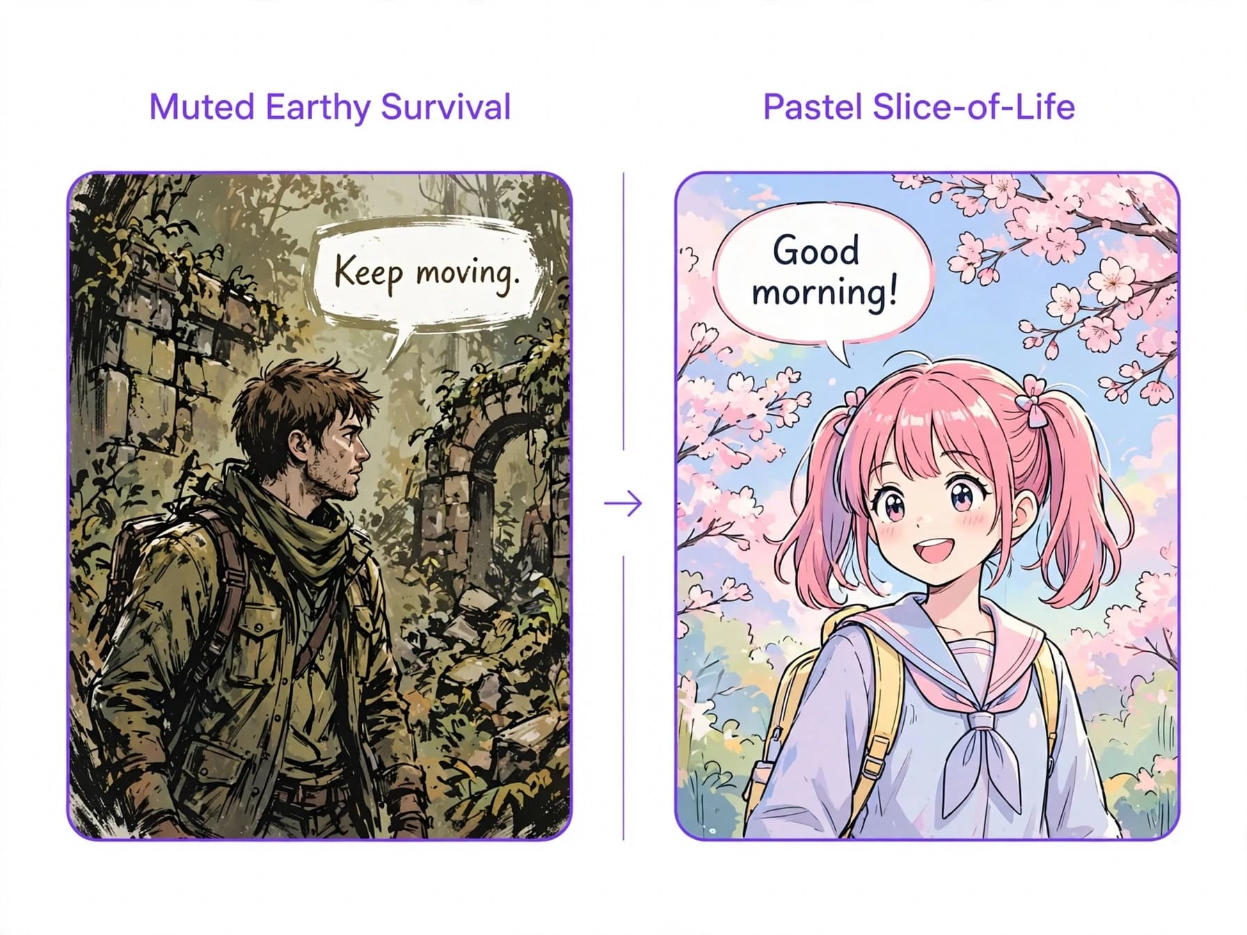
How to choose the right style for your story
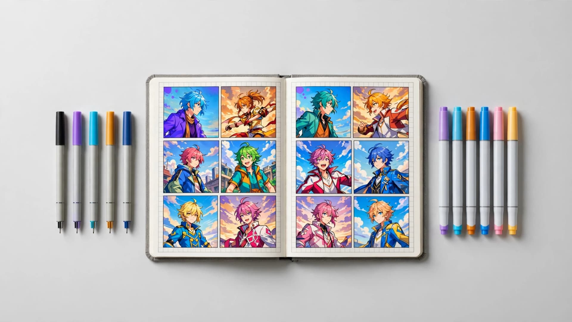
Selecting among varied comic styles requires matching the visual tone of your artwork to the emotional core of your narrative. A gritty psychological mystery falters if drawn with bubbly cartoon proportions, while a lighthearted school comedy feels stiff under heavy noir cross-hatching. Identifying your story genre and intended pacing narrows down the aesthetic choices.
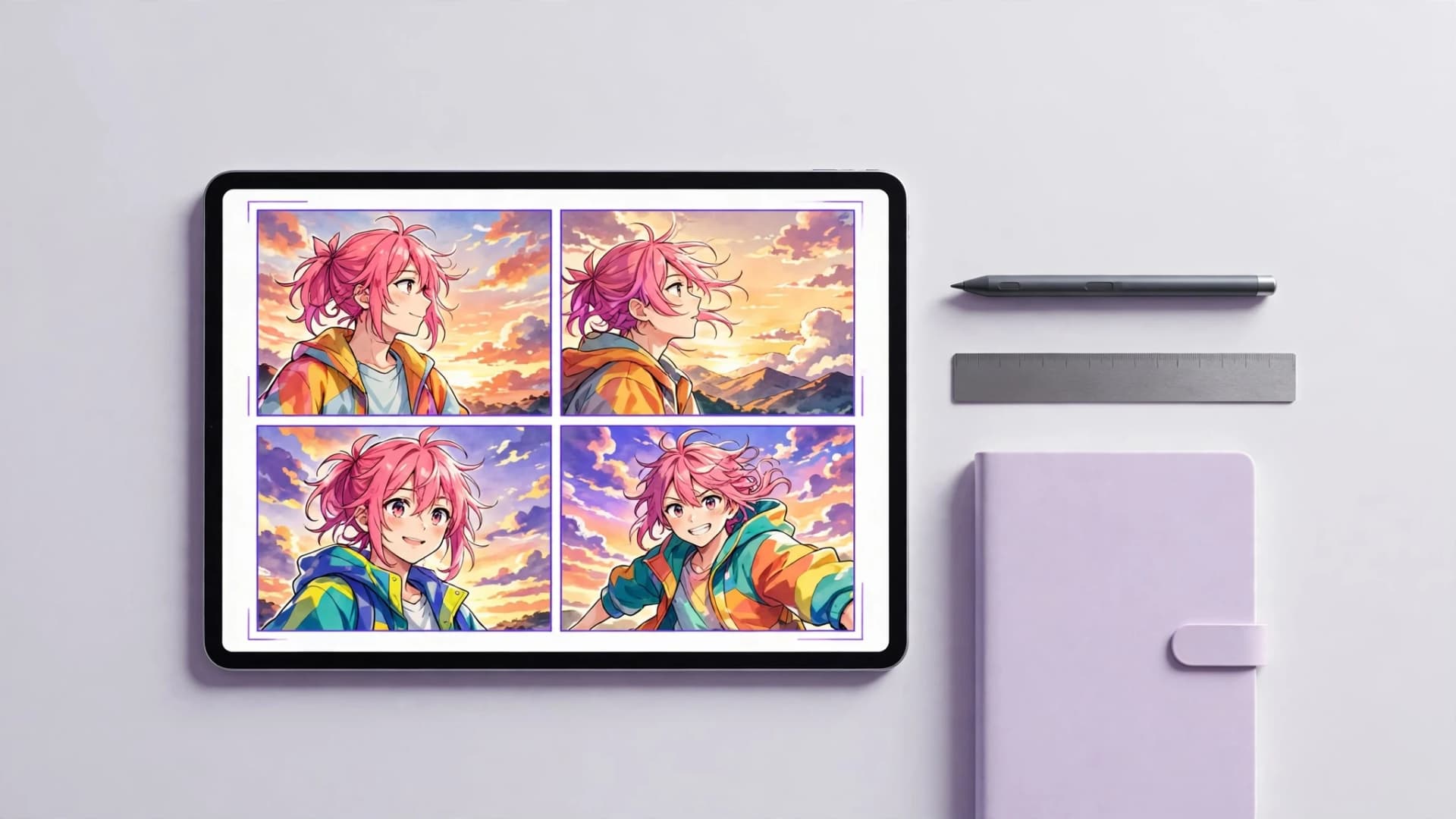
Platform format should also guide your artistic direction. If you plan to share stories online for vertical smartphone reading, clean digital painting with luminous highlights fits the scrolling habit of digital readers. Creators testing ideas in a dedicated manga maker often experiment with screentone textures and expressive line art before settling on a final look.
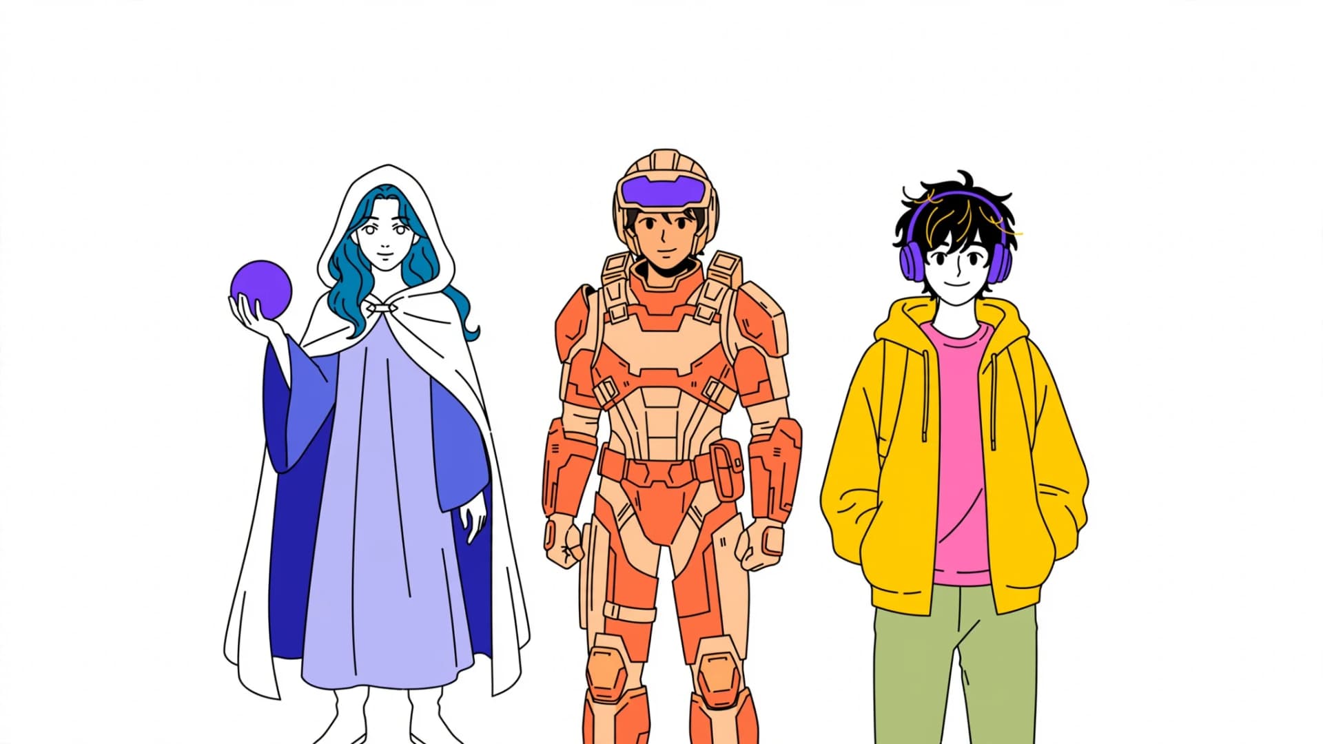
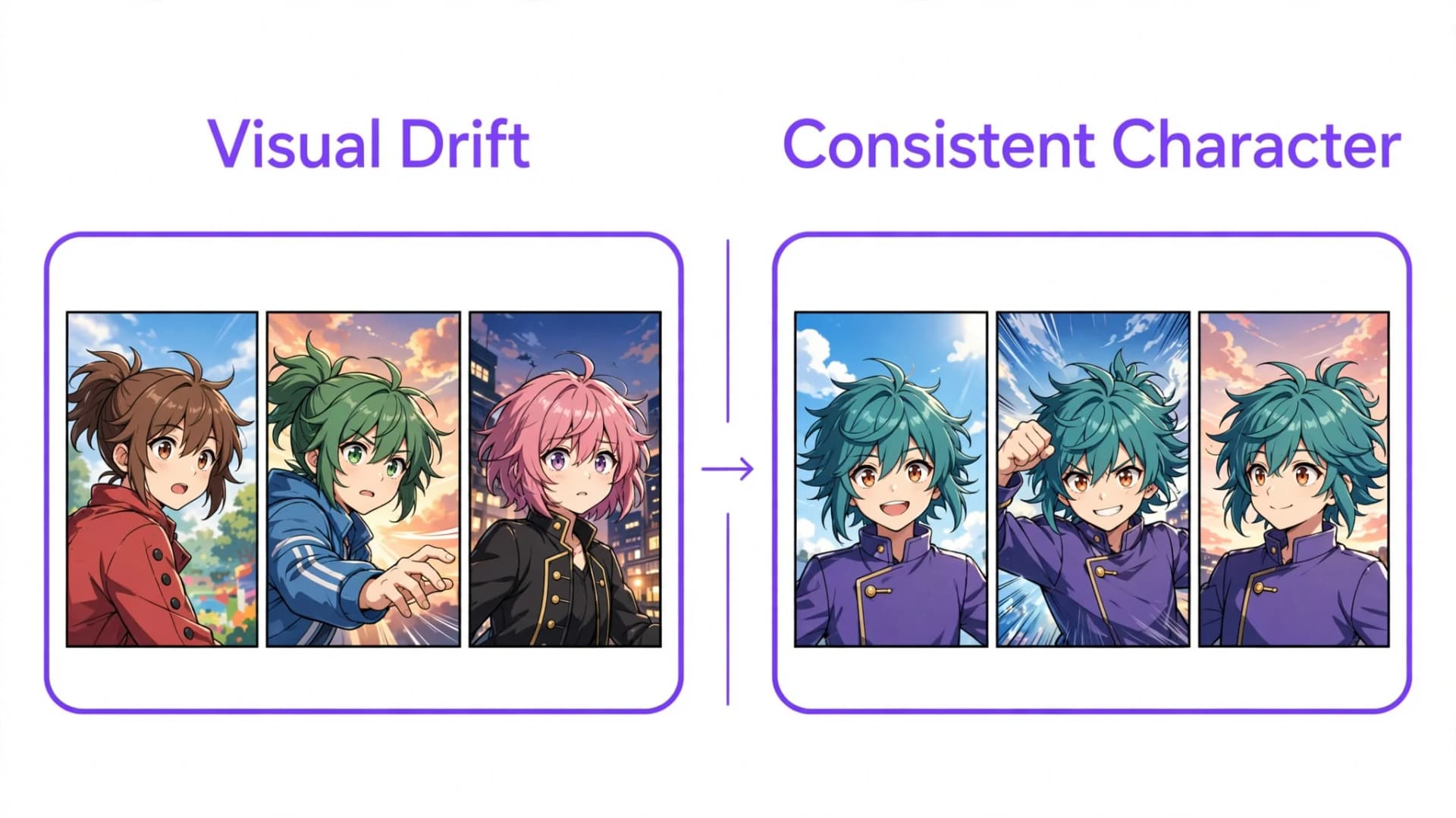
Consistency matters far more than technical complexity across a serialized run. A simple, confident visual treatment sustained across ten pages creates a stronger reading experience than fluctuating styles between panels. Define your character traits, lighting rules, and background details early so the fictional world feels unified.
To see your story in these looks, try the AI comic generator, the manga maker, the AI manhwa generator or the AI webtoon generator.
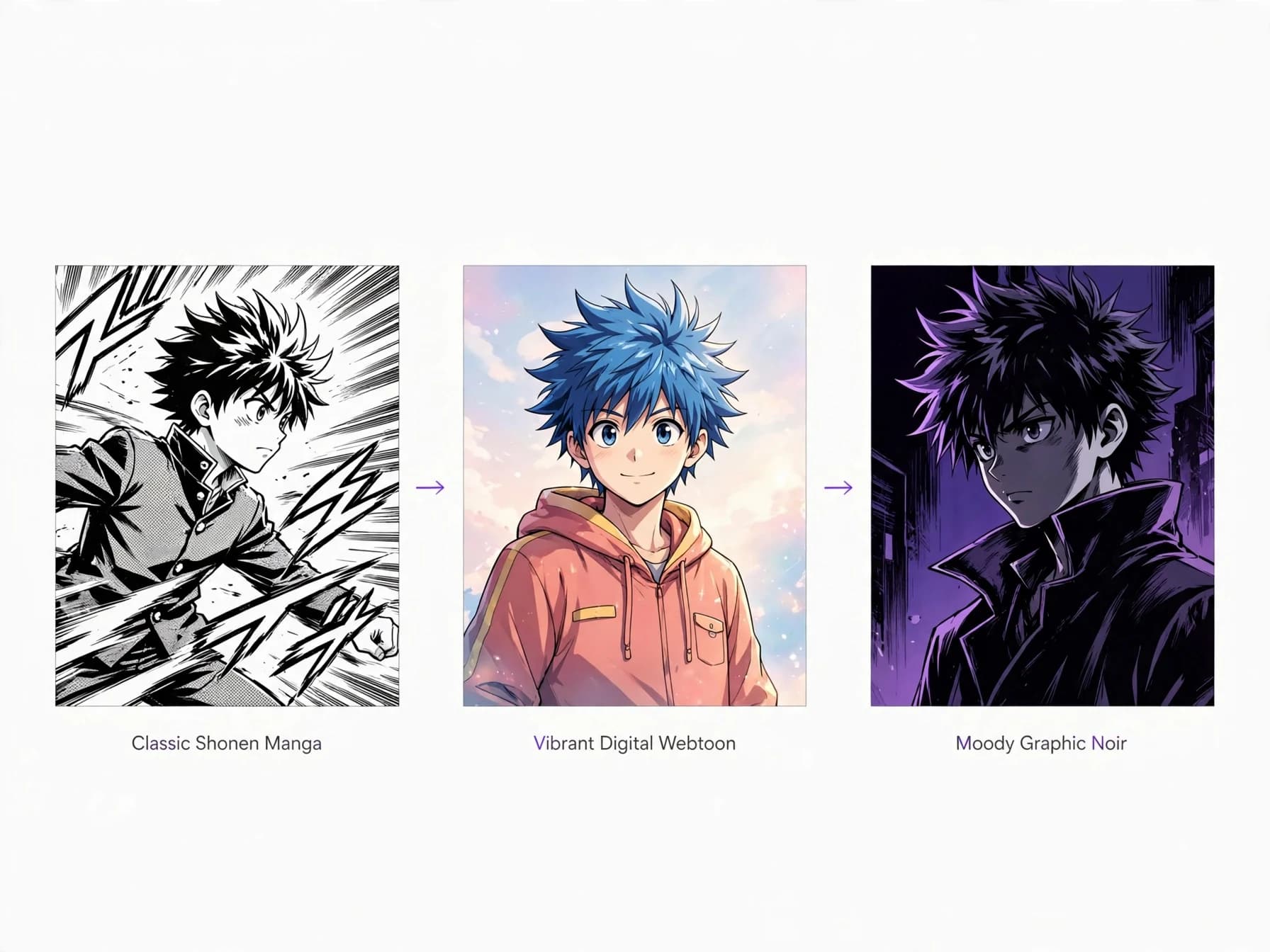
Bringing written scripts into finished visual panels
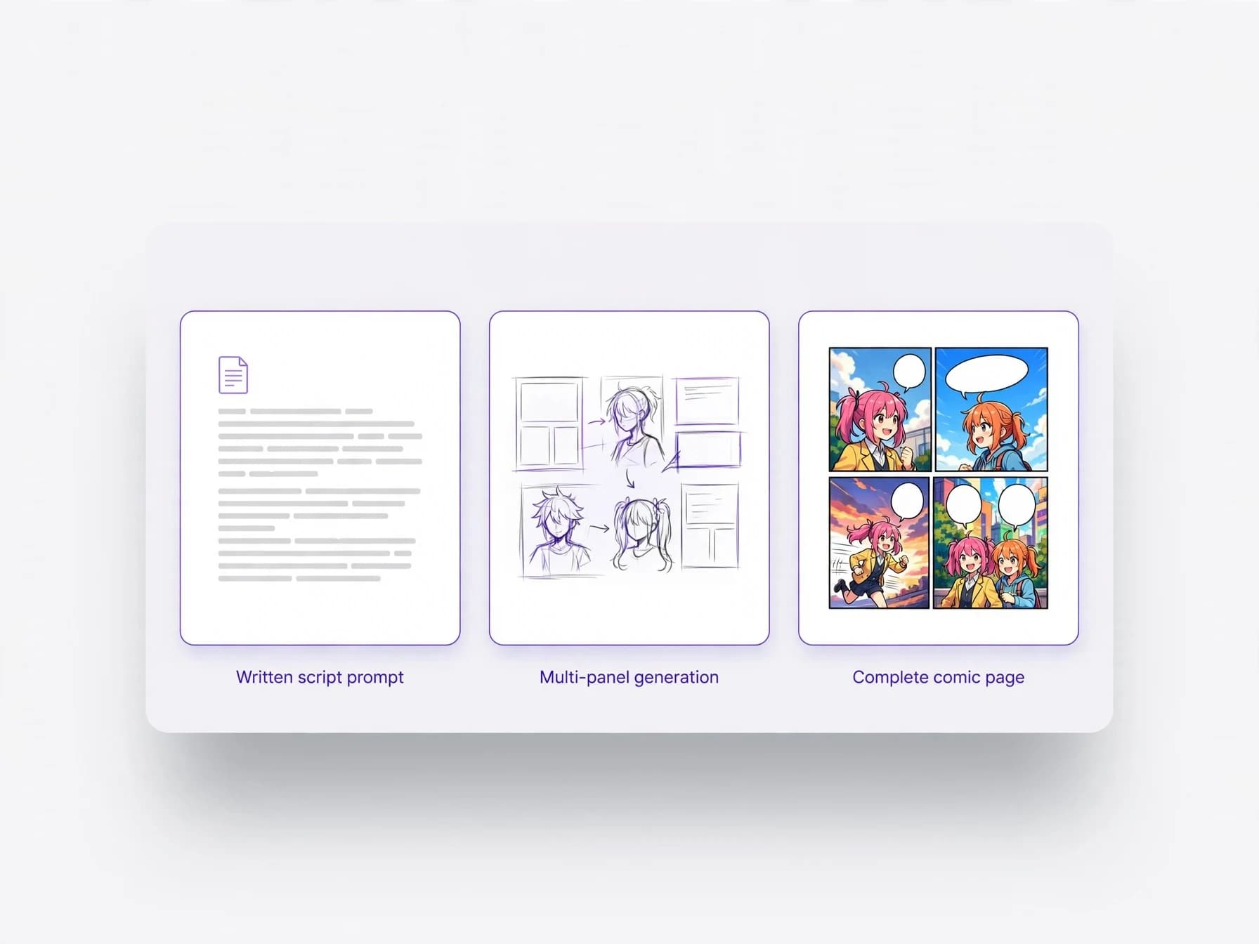
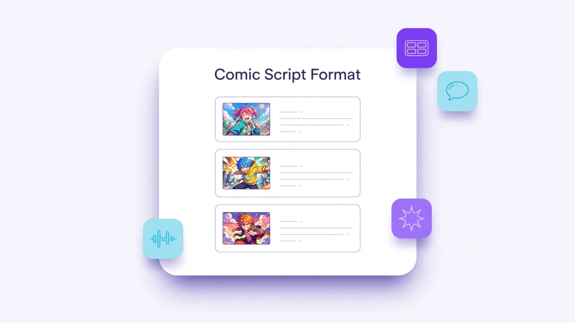
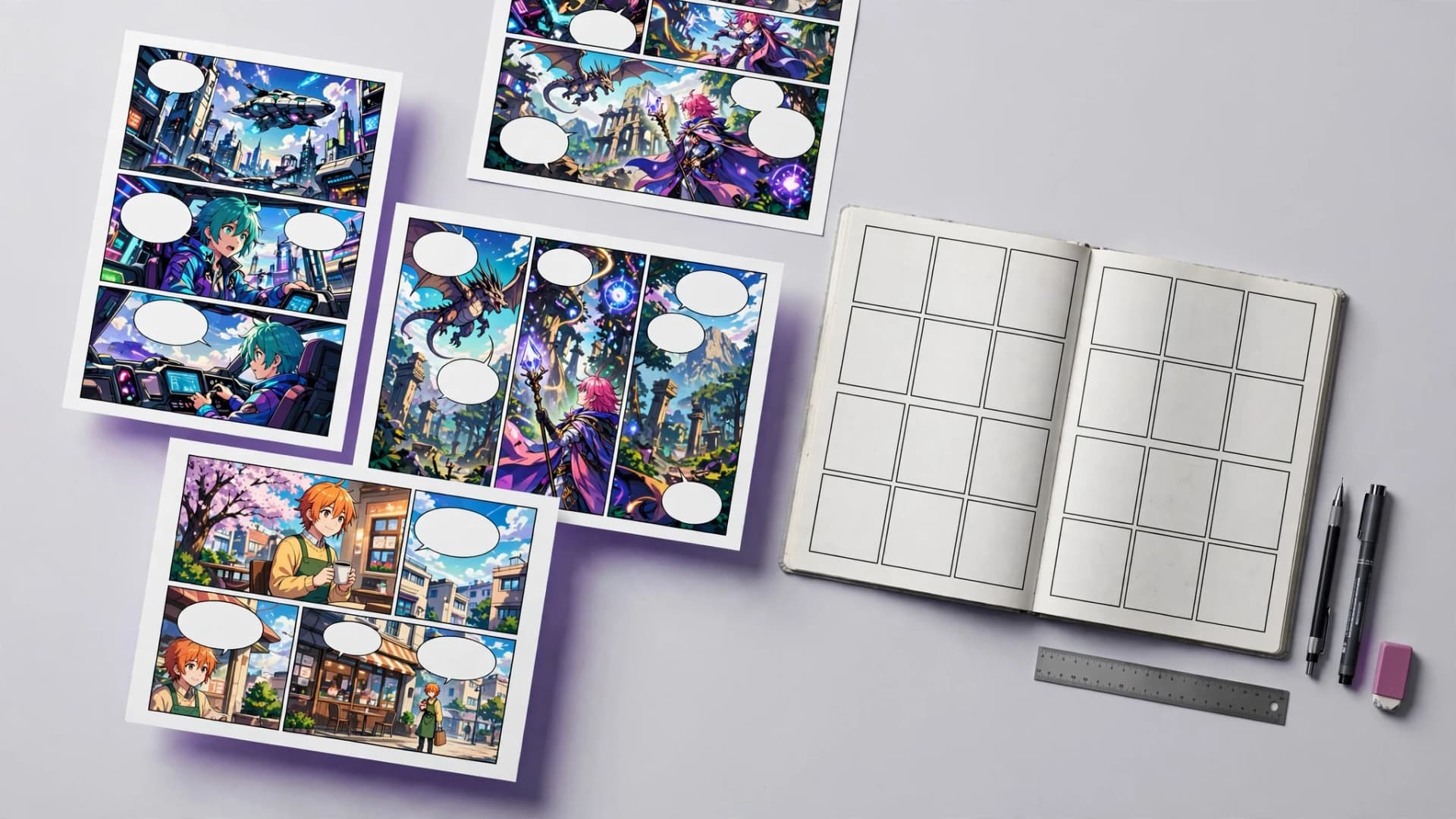
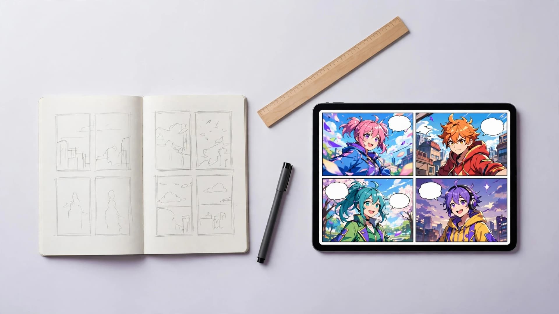
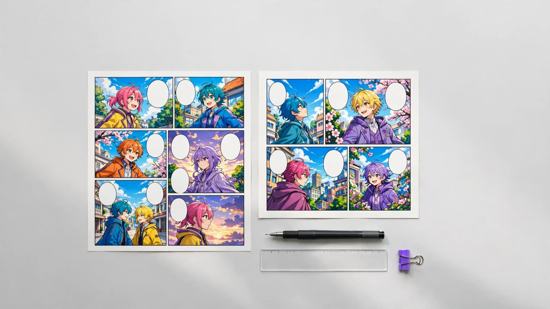
Translating a written script into completed comic pages involves breaking narrative beats into clear compositional panels. Each panel must convey one central action, emotional reaction, or setting detail without crowding dialogue bubbles. Planning panel rhythm ensures quiet character exchanges alternate cleanly with expansive establishing shots.
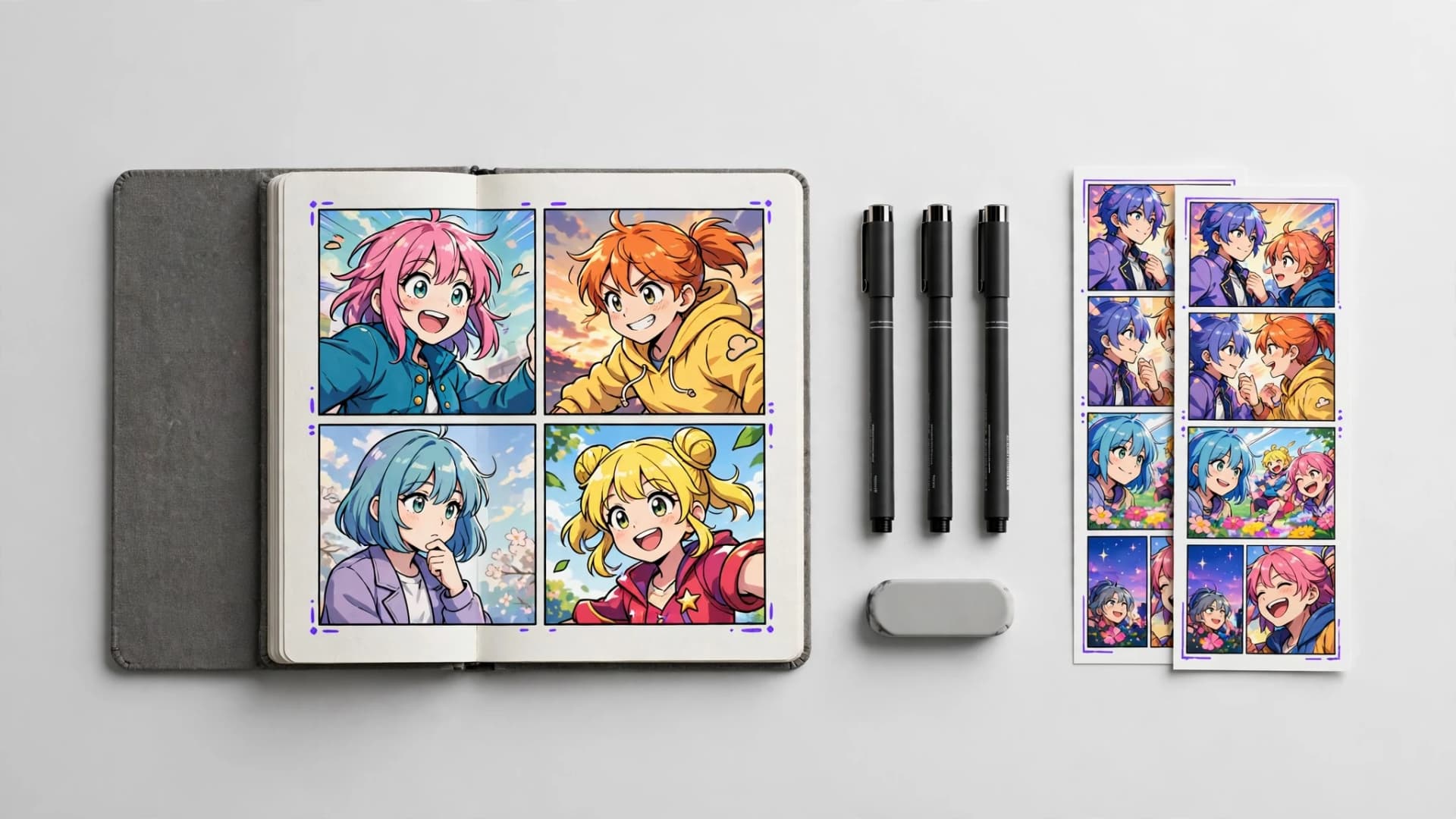
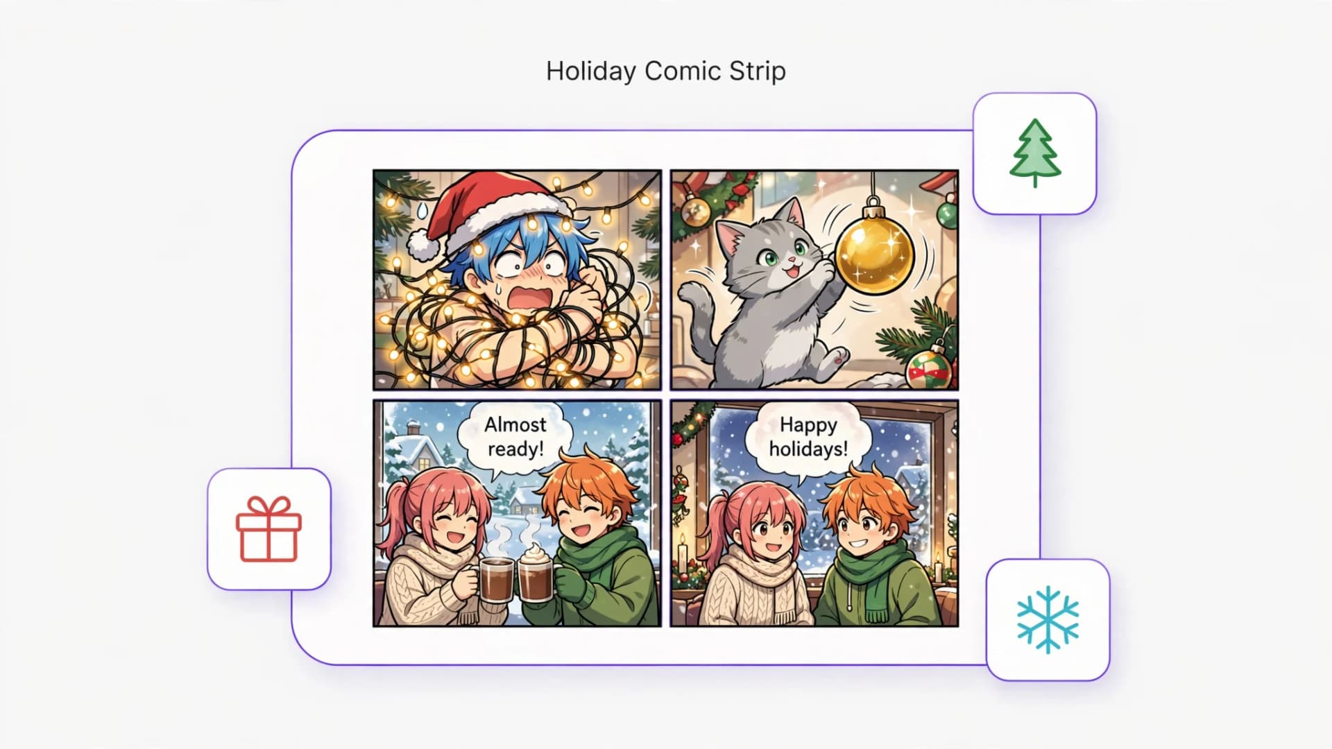
Modern creators can now visualize these scenes rapidly by using an AI comic maker to translate narrative prompts directly into multi-panel layouts. Tools like Yume Comic let you write story beats, select from dozens of curated manga and webtoon styles, and generate full comic pages with integrated speech bubbles. You can preserve recurring character features across panels while exploring different visual treatments.
Once generated in a few minutes, completed pages download as crisp PNG images ready for sharing with readers or collaborators. Evaluating your story in actual panel sequences reveals whether dialogue flows naturally and if scene pacing holds interest. Iterating through different artistic interpretations helps you discover the perfect visual identity for your story.
For cute or simple looks, start with the AI chibi maker or the comic strip maker. New to comics? Read how to make a comic and browse our comic ideas.